弹性模型
Flex 是 Flexible Box 的缩写,意为"弹性布局",用来为盒状模型提供最大的灵活性。
简介
Flex 是 Flexible Box 的缩写,意为"弹性布局",用来为盒状模型提供最大的灵活性。
任何一个容器都可以指定为 Flex 布局。
.box {
  display: flex;
}
行内元素也可以使用 Flex 布局。
.box {
  display: inline-flex;
}
注意
设为 Flex 布局以后,子元素的 float、clear 和 vertical-align 属性将失效。
基本概念
采用 Flex 布局的元素,称为 Flex 容器(flex container),简称"容器"。它的所有子元素自动成为容器成员,称为 Flex 项目(flex item),简称"项目"。
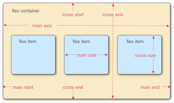
- 主轴 (main axis) 是沿着 flex 元素放置的方向延伸的轴(比如页面上的横向的行、纵向的列)。该轴的开始和结束被称为 main start 和 main end。
- 交叉轴 (cross axis) 是垂直于 flex 元素放置方向的轴。该轴的开始和结束被称为 cross start 和 cross end。
- 设置了
display: flex的父元素被称之为 flex 容器(flex container)。 - 在 flex 容器中表现为柔性的盒子的元素被称之为 flex 项(flex item)
- 单个项目占据的主轴空间叫做 main size,占据的交叉轴空间叫做 cross size。
提示
这张图很有用,可以多看看。
在默认情况下,主轴水平,方向是从左到右;交叉轴垂直,方向是从上到下。
容器的属性
以下 6 个属性设置在容器上。
- flex-direction
- flex-wrap
- flex-flow
- justify-content
- align-items
- align-content
flex-direction
flex-direction 属性决定主轴的方向(即项目的排列方向)。
.box {
  flex-direction: row | row-reverse | column | column-reverse;
}
它可能有 4 个值。
row(默认值): 主轴为水平方向,起点在左端。row-reverse: 主轴为水平方向,起点在右端。column: 主轴为垂直方向,起点在上沿。column-reverse: 主轴为垂直方向,起点在下沿。
注意
请注意,在任何情况下,交叉轴的均为主轴顺时针旋转 90°
flex-wrap
默认情况下,项目都排在一条线(又称"轴线")上。flex-wrap 属性定义,如果一条轴线排不下,如何换行。

.box {
  flex-wrap: nowrap | wrap | wrap-reverse;
}
它可能取三个值。
nowrap(默认): 不换行。nowrap<div class="wrapper"> <div class="item1">1</div> <div class="item2">2</div> <div class="item3">3</div> <div class="item4">4</div> <div class="item5">5</div> <div class="item6">6</div> <div class="item7">7</div> <div class="item8">8</div> <div class="item9">9</div> <div class="item10">10</div> <div class="item11">11</div> <div class="item12">12</div> </div>.wrapper { display: flex; flex-wrap: no-wrap; } .wrapper > div { width: 80px; height: 80px; background-color: rgb(207, 232, 220); border: 2px solid rgb(79, 185, 227); }wrap: 换行,第一行在上方。wrap<div class="wrapper"> <div class="item1">1</div> <div class="item2">2</div> <div class="item3">3</div> <div class="item4">4</div> <div class="item5">5</div> <div class="item6">6</div> <div class="item7">7</div> <div class="item8">8</div> <div class="item9">9</div> <div class="item10">10</div> <div class="item11">11</div> <div class="item12">12</div> </div>.wrapper { display: flex; flex-wrap: wrap; } .wrapper > div { width: 80px; height: 80px; background-color: rgb(207, 232, 220); border: 2px solid rgb(79, 185, 227); }wrap-reverse: 换行,第一行在下方。wrap-reverse<div class="wrapper"> <div class="item1">1</div> <div class="item2">2</div> <div class="item3">3</div> <div class="item4">4</div> <div class="item5">5</div> <div class="item6">6</div> <div class="item7">7</div> <div class="item8">8</div> <div class="item9">9</div> <div class="item10">10</div> <div class="item11">11</div> <div class="item12">12</div> </div>.wrapper { display: flex; flex-wrap: wrap-reverse; } .wrapper > div { width: 80px; height: 80px; background-color: rgb(207, 232, 220); border: 2px solid rgb(79, 185, 227); }
flex-flow
flex-flow 属性是 flex-direction 属性和 flex-wrap 属性的简写形式,默认值为 row nowrap。
.box {
  flex-flow: <flex-direction> || <flex-wrap>;
}
justify-content
justify-content 属性定义了项目在主轴上的对齐方式。
.box {
  justify-content: flex-start | flex-end | center | space-between | space-around;
}<div class="wrapper">
<div class="item1" />
<div class="item2" />
<div class="item3" />
</div>.wrapper {
display: flex;
justify-content: flex-start;
}
.wrapper > div {
height: 60px;
background-color: rgb(207, 232, 220);
border: 2px solid rgb(79, 185, 227);
}
.item1 {
width: 60px;
}
.item2 {
width: 120px;
}
.item3 {
width: 80px;
}<div class="wrapper">
<div class="item1" />
<div class="item2" />
<div class="item3" />
</div>.wrapper {
display: flex;
justify-content: flex-end;
}
.wrapper > div {
height: 60px;
background-color: rgb(207, 232, 220);
border: 2px solid rgb(79, 185, 227);
}
.item1 {
width: 60px;
}
.item2 {
width: 120px;
}
.item3 {
width: 80px;
}<div class="wrapper">
<div class="item1" />
<div class="item2" />
<div class="item3" />
</div>.wrapper {
display: flex;
justify-content: center;
}
.wrapper > div {
height: 60px;
background-color: rgb(207, 232, 220);
border: 2px solid rgb(79, 185, 227);
}
.item1 {
width: 60px;
}
.item2 {
width: 120px;
}
.item3 {
width: 80px;
}<div class="wrapper">
<div class="item1" />
<div class="item2" />
<div class="item3" />
</div>.wrapper {
display: flex;
justify-content: space-between;
}
.wrapper > div {
height: 60px;
background-color: rgb(207, 232, 220);
border: 2px solid rgb(79, 185, 227);
}
.item1 {
width: 60px;
}
.item2 {
width: 120px;
}
.item3 {
width: 80px;
}<div class="wrapper">
<div class="item1" />
<div class="item2" />
<div class="item3" />
</div>.wrapper {
display: flex;
justify-content: space-around;
}
.wrapper > div {
height: 60px;
background-color: rgb(207, 232, 220);
border: 2px solid rgb(79, 185, 227);
}
.item1 {
width: 60px;
}
.item2 {
width: 120px;
}
.item3 {
width: 80px;
}<div class="wrapper">
<div class="item1" />
<div class="item2" />
<div class="item3" />
</div>.wrapper {
display: flex;
justify-content: space-evenly;
}
.wrapper > div {
height: 60px;
background-color: rgb(207, 232, 220);
border: 2px solid rgb(79, 185, 227);
}
.item1 {
width: 60px;
}
.item2 {
width: 120px;
}
.item3 {
width: 80px;
}它可能取 5 个值,具体对齐方式与轴的方向有关。下面假设主轴为从左到右。
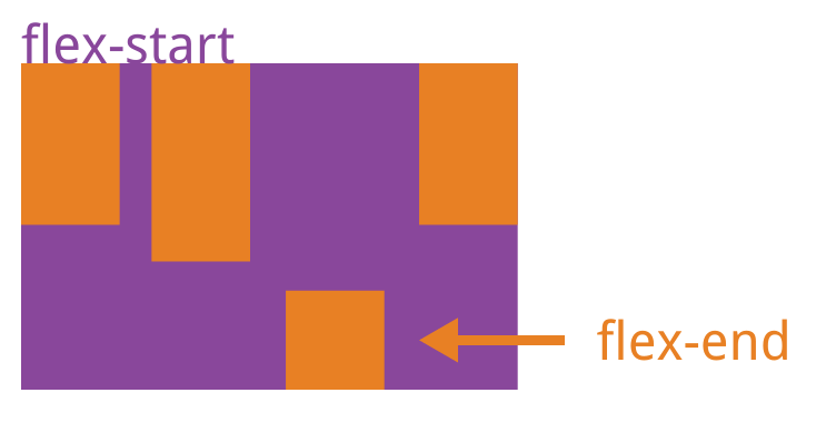
flex-start(默认值): 左对齐flex-end: 右对齐center: 居中space-between: 两端对齐,项目之间的间隔都相等。space-around: 每个项目两侧的间隔相等。所以,项目之间的间隔比项目与边框的间隔大一倍。space-evenly: 均匀排列每个元素,每个元素之间的间隔相等。
align-items
align-items 属性定义项目在交叉轴上如何对齐。
.box {
  align-items: flex-start | flex-end | center | baseline | stretch;
}<div class="wrapper">
<div class="item1" />
<div class="item2" />
<div class="item3" />
<div class="item4" />
</div>.wrapper {
display: flex;
justify-content: space-between;
align-items: flex-start;
height: 160px;
}
.wrapper > div {
width: 60px;
background-color: rgb(207, 232, 220);
border: 2px solid rgb(79, 185, 227);
}
.item1 {
height: 60px;
}
.item2 {
height: 120px;
}
.item3 {
height: 80px;
}
.item4 {
height: 40px;
}<div class="wrapper">
<div class="item1" />
<div class="item2" />
<div class="item3" />
<div class="item4" />
</div>.wrapper {
display: flex;
justify-content: space-between;
align-items: flex-end;
height: 160px;
}
.wrapper > div {
width: 60px;
background-color: rgb(207, 232, 220);
border: 2px solid rgb(79, 185, 227);
}
.item1 {
height: 60px;
}
.item2 {
height: 120px;
}
.item3 {
height: 80px;
}
.item4 {
height: 40px;
}<div class="wrapper">
<div class="item1" />
<div class="item2" />
<div class="item3" />
<div class="item4" />
</div>.wrapper {
display: flex;
justify-content: space-between;
align-items: center;
height: 160px;
}
.wrapper > div {
width: 60px;
background-color: rgb(207, 232, 220);
border: 2px solid rgb(79, 185, 227);
}
.item1 {
height: 60px;
}
.item2 {
height: 120px;
}
.item3 {
height: 80px;
}
.item4 {
height: 40px;
}<div class="wrapper">
<div class="item1">text</div>
<div class="item2">text</div>
<div class="item3">text</div>
<div class="item4">text</div>
</div>.wrapper {
display: flex;
justify-content: space-between;
align-items: baseline;
height: 160px;
}
.wrapper > div {
width: 60px;
background-color: rgb(207, 232, 220);
border: 2px solid rgb(79, 185, 227);
}
.item1 {
height: 60px;
}
.item2 {
padding-top: 20px;
height: 100px;
}
.item3 {
padding-top: 40px;
height: 40px;
}
.item4 {
height: 40px;
}<div class="wrapper">
<div class="item1" />
<div class="item2" />
<div class="item3" />
<div class="item4" />
</div>.wrapper {
display: flex;
justify-content: space-between;
align-items: stretch;
height: 160px;
}
.wrapper > div {
width: 60px;
background-color: rgb(207, 232, 220);
border: 2px solid rgb(79, 185, 227);
}它可能取 5 个值。具体的对齐方式与交叉轴的方向有关,下面假设交叉轴从上到下。
flex-start: 交叉轴的起点对齐。flex-end: 交叉轴的终点对齐。center: 交叉轴的中点对齐。baseline: 项目的第一行文字的基线对齐。stretch(默认值): 如果项目未设置高度或设为 auto,将占满整个容器的高度。
align-content
align-content 属性定义了多根轴线的对齐方式。如果项目只有一根轴线,该属性不起作用。
.box {
  align-content: flex-start | flex-end | center | space-between | space-around | stretch;
}
该属性可能取 6 个值。
flex-start: 与交叉轴的起点对齐。flex-end: 与交叉轴的终点对齐。center: 与交叉轴的中点对齐。space-between: 与交叉轴两端对齐,轴线之间的间隔平均分布。space-around: 每根轴线两侧的间隔都相等。所以,轴线之间的间隔比轴- 线与边框的间隔大一倍。stretch(默认值): 轴线占满整个交叉轴。
项目的属性
以下 6 个属性设置在项目上。
- order
- flex-grow
- flex-shrink
- flex-basis
- flex
- align-self
order
order 属性定义项目的排列顺序。数值越小,排列越靠前,默认为 0。

.item {
  order: <integer>;
}
flex-grow
flex-grow 属性定义项目的放大比例,默认为 0,即如果存在剩余空间,也不放大。
.item {
  flex-grow: <number>; /* default 0 */
}
如果所有项目的 flex-grow 属性都为 1,则它们将等分剩余空间(如果有的话)。如果一个项目的 flex-grow 属性为 2,其他项目都为 1,则前者占据的剩余空间将比其他项多一倍。
flex-shrink
flex-shrink 属性定义了项目的缩小比例,默认为 1,即如果空间不足,该项目将缩小。
.item {
  flex-shrink: <number>; /* default 1 */
}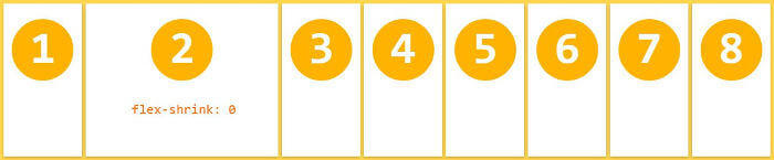
如果所有项目的 flex-shrink 属性都为 1,当空间不足时,都将等比例缩小。如果一个项目的 flex-shrink 属性为 0,其他项目都为 1,则空间不足时,前者不缩小。
提示
负值对该属性无效。
flex-basis
flex-basis 属性定义了在分配多余空间之前,项目占据的主轴空间 (main size)。浏览器根据这个属性,计算主轴是否有多余空间。它的默认值为 auto,即项目的本来大小。
.item {
  flex-basis: <length> | auto; /* default auto */
}
它可以设为跟 width 或 height 属性一样的值(比如 350px),则项目将占据固定空间。
flex
flex 属性是 flex-grow, flex-shrink 和 flex-basis 的简写,默认值为 0 1 auto。后两个属性可选。
.item {
  flex: none | [ < "flex-grow" > < "flex-shrink" >? || < "flex-basis" >];
}
该属性有两个快捷值: auto (1 1 auto) 和 none (0 0 auto)。
建议优先使用这个属性,而不是单独写三个分离的属性,因为浏览器会推算相关值。
align-self
align-self 属性允许单个项目有与其他项目不一样的对齐方式,可覆盖 align-items 属性。默认值为 auto,表示继承父元素的 align-items 属性,如果没有父元素,则等同于 stretch。
.item {
  align-self: auto | flex-start | flex-end | center | baseline | stretch;
}
该属性可能取 6 个值,除了 auto,其他都与 align-items 属性完全一 致。